COLOUR THEORY CHOICES
In fact, knowing colour relationships and how colours interact is a powerful tool, just like any other at your disposal.
Once you truly master colour theory, I guarantee your work will instantly enter a new level.
In this article, we’ll dive into the essential concepts of colour theory, equipping you with the knowledge and techniques to make informed color choices in your artwork.
You’ll learn how to create harmony by understanding the relationships between colours, explore the emotional impact of different hues, and discover how varying saturation and value can bring depth and realism to your work.
Let’s begin!
A Note About Colour
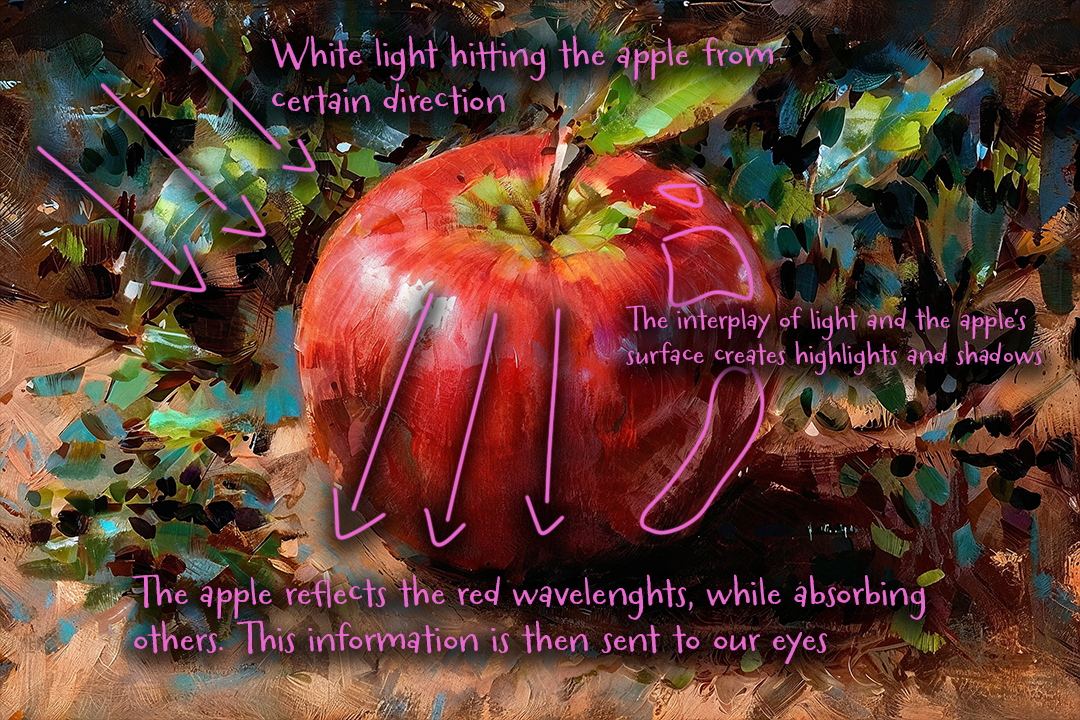
In its most basic form, colour is an illusion, created by the way our eyes and brain respond to different wavelengths of light.
Objects don’t inherently have colour; instead, they reflect certain wavelengths of light while absorbing others.
Object relfect light based on their material properties and surface textures. When light hits an object, certain wavelengths are absorbed while others are reflected.
The reflected wavelengths enter our eye, where photoreceptors known as cones recieve them.
From the basic colours that our eyes perceive - red, green, and blue - our brain is able to interpret a wide range of colours through a process called colour mixing.
The Basics of Colour Theory
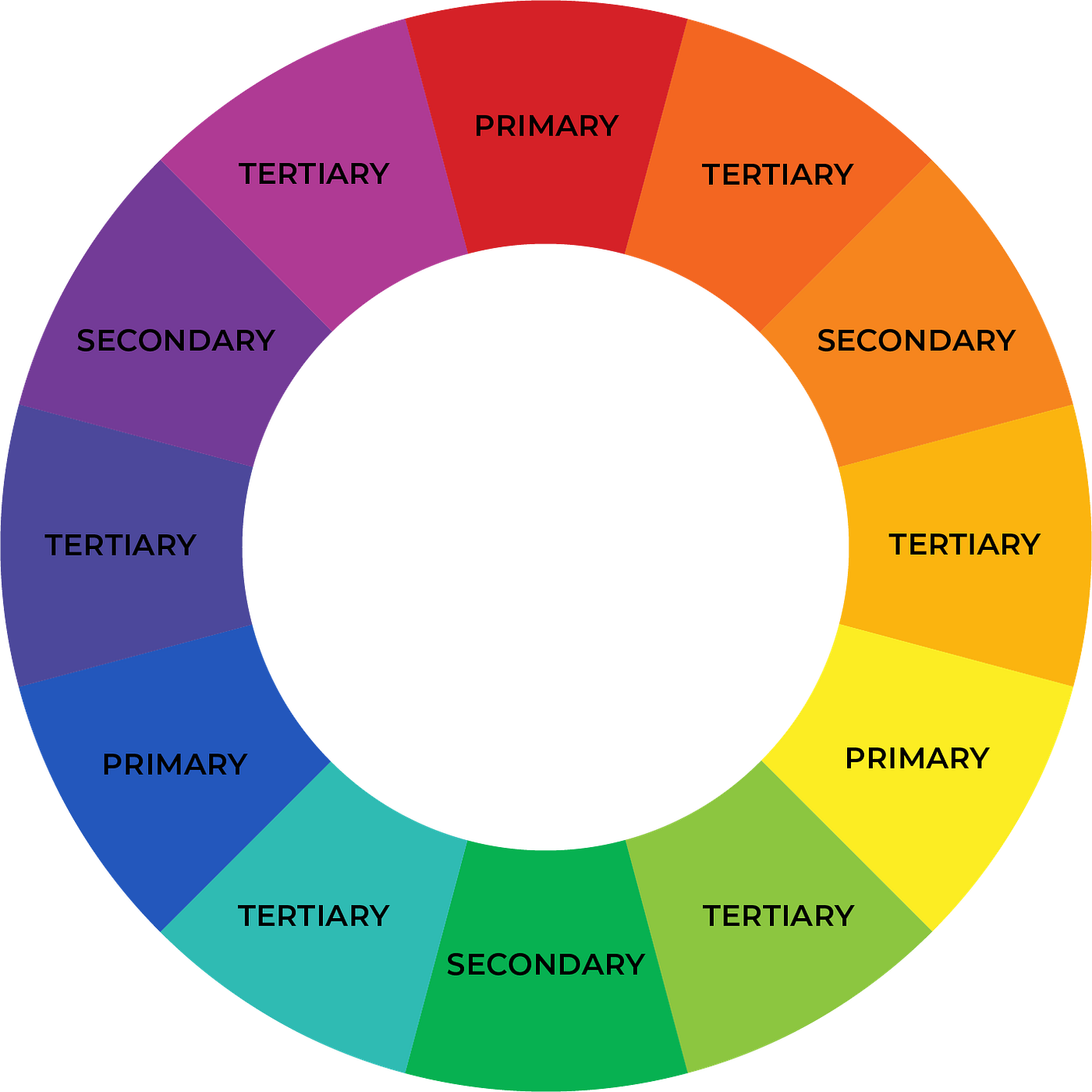
Before diving into advanced techniques in colour theory, it’s essential to understand its basic building blocks. The most foundational tool in colour theory is the color wheel, which arranges colours in a circular format to illustrate their relationships - a concept that dates back to antiquity.
The color wheel helps artists visualize how different colours interact, making it easier to choose harmonious combinations and understand how colours complement or contrast with each other.
The color wheel has three main categories
- Primary Colours - These are the fundamental colors that cannot be created by mixing other colors. They include red, yellow, and blue.
- Secondary Colours - These colors are created by mixing two primary colors. They include green (blue + yellow), orange (red + yellow), and purple (red + blue).
- Tetiary Colours - These colours result from mixing a primary colour with a secondary colour, creating shades like red-orange, yellow-green, and blue-purple.
Colour Harmonies and Schemes
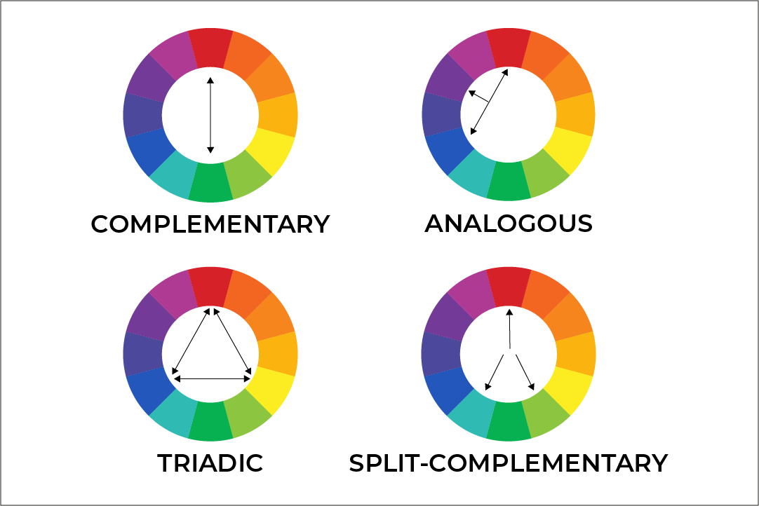
Colours can interact with each other in various ways, depending on the effect you wish to achieve. We will discuss the four most common colour schemes that will help you achieve harmony and balance in your work.
 A Depiction Of Four Most Common
 Complementary Colours: These colors sit opposite each other on the colour wheel and, when paired, create strong visual contrast in a piece. Use complementary colours thoughtfully, as too much contrast can lead to visual disharmony.
To apply this scheme effectively, choose one colour as the dominant hue and use its complement selectively, such as in highlights or focal points, to enhance depth and draw attention without overwhelming the composition.
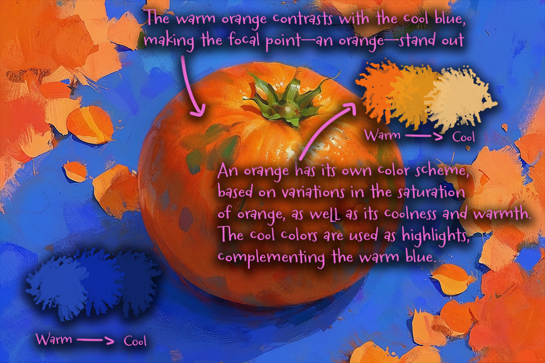
Analogous Colours: Analogous colours sit next to each other on the colour wheel, such as blue, blue-green, and green. They blend smoothly and are often used to create a cohesive and calming look in a piece.
Triadic Colours: Triadic schemes involve three colours that are evenly spaced around the colour wheel (such as red, yellow, and blue). This scheme creates a dynamic balance of colours, making it ideal for bold, lively compositions.
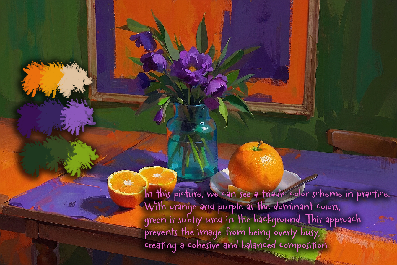
Split-Complementary Colours: This scheme is a variation of complementary colours, where you pick one base colour and then two adjacent colours to its complement. Split-complementary schemes offer high contrast with a softer effect than pure complementary colours, making them easier to balance.
Warm vs. Cool Colours
Warm Colors: These are colours like red, orange, and yellow. They tend to evoke feelings of warmth, energy, and excitement.
In compositions, warm colours often appear closer to the viewer and draw attention, making them great for focal points.
Cool Colors: Blues, greens, and purples are considered cool colours. They are generally calming and recede into the background, creating a sense of depth and distance.
Cool colours can add a serene, soothing quality to an artwork.
I highly encourage you to study emotional aspects of each colour, as they all can build a perception of your artwork (e.g., red = energy and passion, blue = calmness and trust). Colours also have a cultural aspect, so different cultures can perceive the same colors differently. You can easily use these psychological aspects to your advantage.
Value, Saturation, and Intensity
Colour is not just about hue; it’s also about the value, saturation, and intensity of each colour, which together help create depth and emphasis.
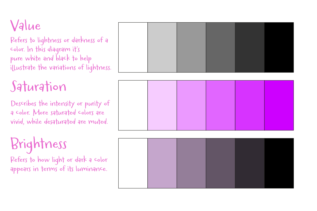
Here’s a clear explanation of value, saturation, and brightness:
- Value refers to the lightness or darkness of a colour, determining how much light it reflects. It’s independent of hue and is adjusted by adding black or white.
- Saturation is the intensity or purity of a colour. High saturation means a colour is vivid and intense, while low saturation means it’s muted or grayish.
- Brightness refers to how light or dark a colour appears, related to its perceived luminance. It overlaps with value but focuses on how “bright” a colour seems in its visual impact.
These three elements together define how a colour appears in terms of its visual qualities.
How to Use Colours and Colour Palettes in Your Artwork
Before using colours in your artwork, carefully study the relationship between light and shadow in your composition.
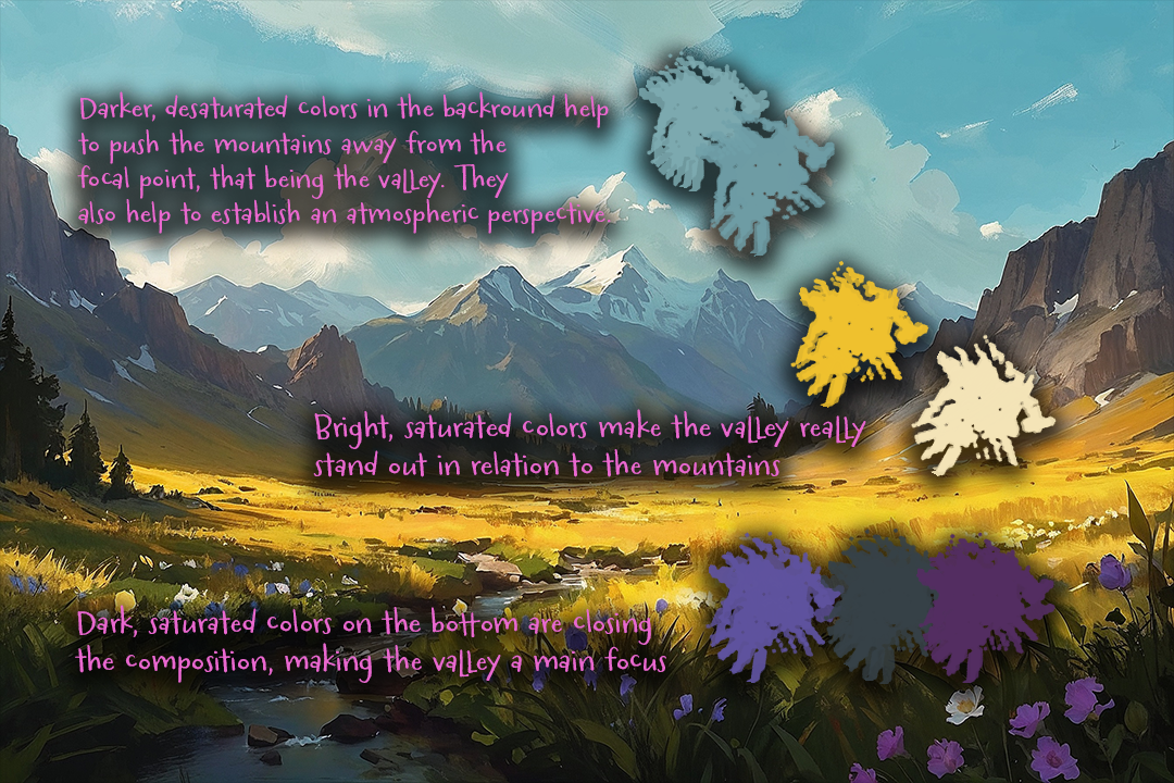
Identify your darkest darks and lightest lights, which will form the ends of your value spectrum, and select two midtones between them.
It’s helpful to start with a thumbnail sketch of your composition using only black and white variations to establish the value structure. Here’s an example.
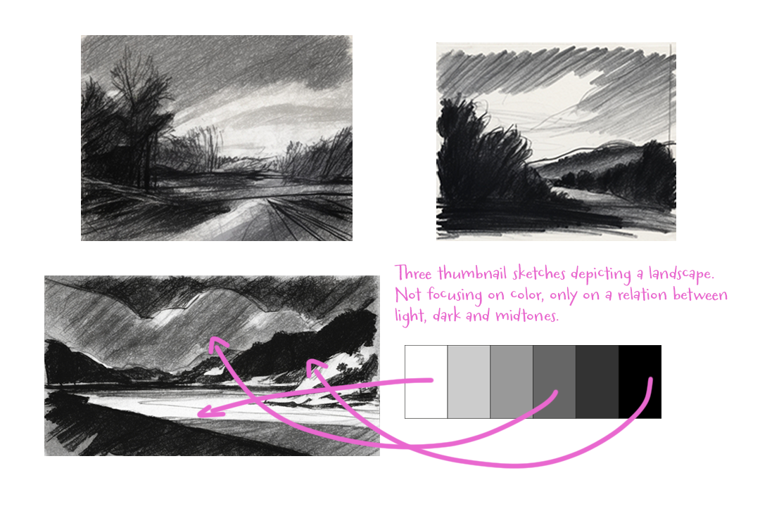
After this step you can choose your dominant hue and pick a colour scheme that fits your liking. Begin adding colour to your artwork, always keeping the relationship between shadow and light in mind.
Remember that it’s all about experimenting with what you like, with incorporating the previous rules.
Create your own palettes, try something unconventional and have fun!
Master Study with Colour
A master study with colour is a valuable exercise where you recreate a famous or inspiring artwork to better understand the artist’s use of colour, light, and composition.
Start by choosing a piece that resonates with you, focusing on one with a compelling colour palette.
As you recreate the work, pay attention to the hues, saturation, and value choices that the artist used to convey mood, depth, and balance. Analyzing and reproducing these colour decisions can reveal effective techniques for your own art.


Comments
Post a Comment